
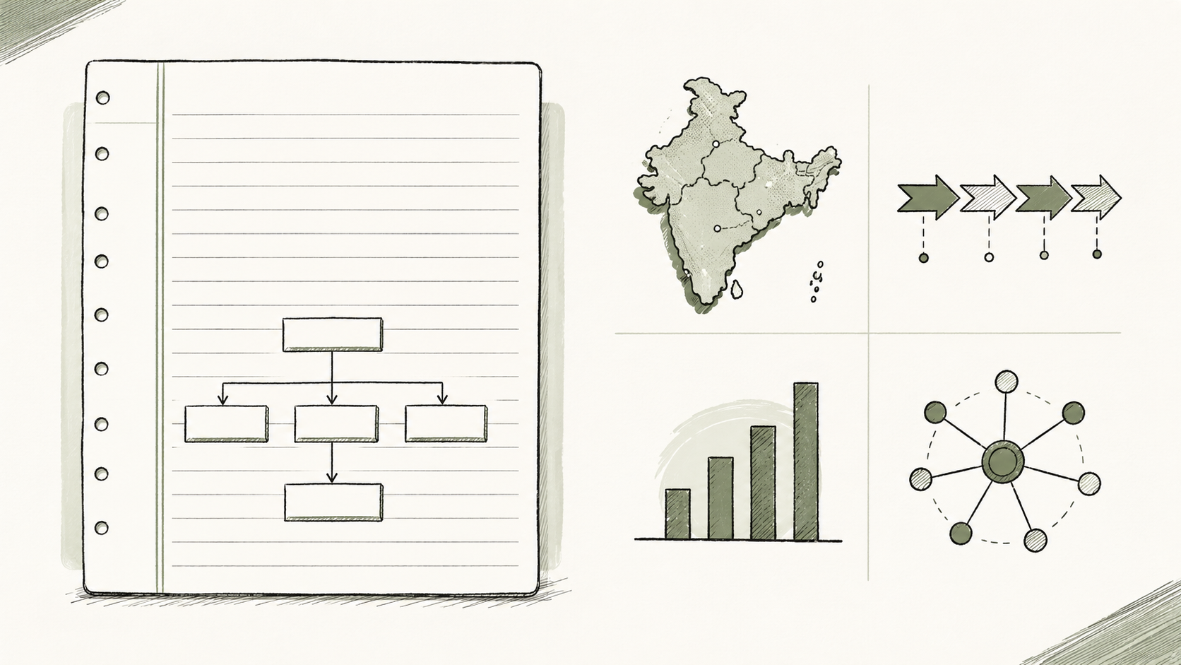
Diagrams, maps, and flowcharts compress complex ideas into a glance — exactly what a tired examiner scanning hundreds of scripts wants. Used well, a single visual can replace 80–100 words of prose, protect your word limit, and signal that you think in structure. Used poorly, it clutters the page and wastes precious minutes.
This guide covers when to draw, which visual fits which question type, and how toppers use visuals under real exam pressure — with PYQ links you can practise on UPSCYatra.
Key highlights
- Aim for 10–12 visuals across a full GS paper (roughly one in every second answer), not one in every question.
- Match the visual to the directive — a timeline for chronology, a map for spatial distribution, a flowchart for process.
- Label every box and arrow in 2–4 words; unlabelled sketches earn little credit.
- Study topper copies for handwriting-scale diagrams — not coaching booklet art.
Why visuals matter in Mains
UPSC Mains is not a knowledge dump. Examiners reward clarity under time pressure. Across four GS papers you answer roughly 20 questions in three hours per paper — about seven minutes per 10-mark question. Visuals help in three ways:
| Benefit | What it means in the exam hall |
|---|---|
| Time | A disaster-management cycle or GST flow drawn in 45 seconds can stand in for a paragraph you cannot afford to write. |
| Readability | Subheads plus one diagram break the "wall of text" pattern examiners see all day. |
| Analytical signal | A stakeholder map or cause–effect chain shows you can structure an issue — the skill UPSC tests beyond memory. |
The goal is not decoration. Every visual must add information your subheads do not already state verbatim.
How many diagrams per paper?
A practical rule used by consistent scorers:
| Paper | Suggested visuals | Typical placements |
|---|---|---|
| GS I | 3–4 | Maps (geography), timelines (history), society pyramids |
| GS II | 2–3 | Federalism diagrams, legislative flow, IR maps |
| GS III | 3–4 | Economy process chains, disaster cycle, environment cause–effect |
| GS IV | 2–3 | Stakeholder maps in case studies, ethical decision trees |
That totals 10–12 across all four GS papers — enough to stand out without turning every answer into a drawing sheet.
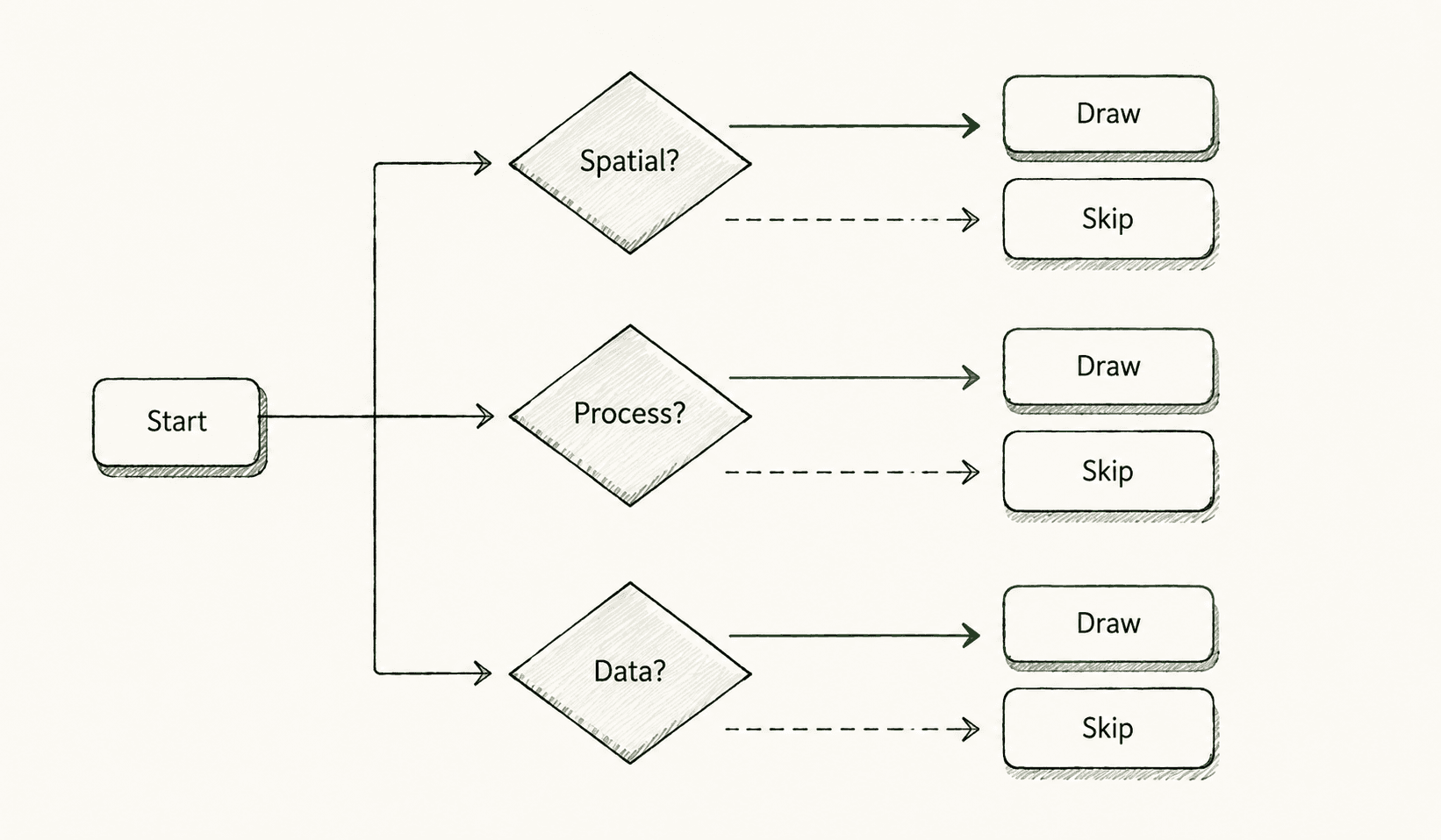
When to skip
Skip diagrams when: (1) the question is pure theory with a tight 150-word limit, (2) your sketch would repeat subheads word-for-word, (3) you are unsure of factual labels (a wrong map hurts more than no map), or (4) you are already behind on time in the last hour of the paper.
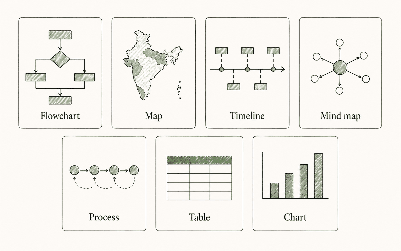
Seven visual types — and when each fits
| Type | Best for | GS papers | Draw time (target) |
|---|---|---|---|
| Flowchart | Processes, policy chains, decision paths | II, III, IV | 45–90 sec |
| Map | Distribution, routes, hazard zones, IR | I, III | 60–120 sec |
| Timeline | Historical sequences, reform chronology | I, II | 45–60 sec |
| Mind map / web | Multi-dimensional topics, ethics theories | IV, Essay | 60–90 sec |
| Process diagram | Economic mechanisms, S&T cycles | III | 60–90 sec |
| Table | Compare–contrast (India vs USA, pros vs cons) | II, III | 30–60 sec |
| Chart (bar / pie / line) | Census, budget, committee data | I, II, III | 60–120 sec |
GS Paper I — maps, timelines, environment chains
GS I rewards spatial and chronological thinking. Geography and disaster questions almost invite a sketch; history questions reward compact timelines.
Maps
Use a rough India outline (or regional inset) when the question asks about distribution, location, or spatial patterns.
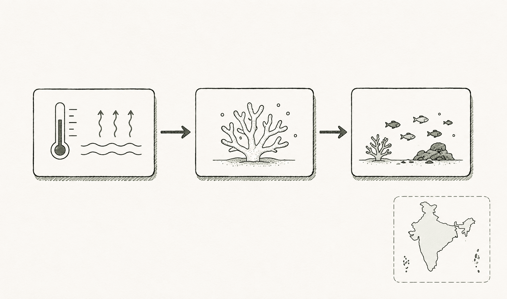
PYQ fit: Assess the impact of global warming on the coral life system with examples. (GS I, 2019)
| Weak | Strong |
|---|---|
| Paragraph on bleaching with no spatial anchor | Small map marking Gulf of Mannar, Lakshadweep, Andaman reefs + arrow chain: SST rise → bleaching → biodiversity loss |
PYQ fit: What is sea surface temperature rise? How does it affect the formation of tropical cyclones? (GS I, 2024)
Draw a simple cyclogenesis chain: warm SST → evaporation → low pressure → cyclone formation, with a coastal map marking Bay of Bengal / Arabian Sea vulnerability if space allows.
Timelines
History and post-independence questions often ask for sequence or evolution. A horizontal timeline saves words.
PYQ fit: Highlight the Central Asian and Greco-Bactrian elements in Gandhara art. (GS I, 2019)
A timeline from Kushan period → Gandhara schools → Hellenistic motifs is optional; a labeled comparison table (Greco-Roman column vs Indian column) may score better for "Highlight."
Society and urbanisation
PYQ fit: Discuss the various social problems which originated out of the speedy process of urbanisation in India. (GS I, 2013)
Use a hub diagram: Urbanisation at centre → spokes for housing, sanitation, crime, informal labour, governance gaps — each spoke gets one scheme or statistic in text below.
Paper-specific depth: GS1 answer writing guide.
GS Paper II — institutions, federalism, governance flow
GS II answers lean on Articles, judgments, and institutional relationships. Diagrams that show how institutions connect work better than decorative boxes.
Federalism and Centre–State relations
PYQ fit: The concept of cooperative federalism has been increasingly emphasized in recent years. (GS II, 2015)
PYQ fit: Examine the evolving pattern of Centre-State financial relations in the context of planned development in India. (GS II, 2025)
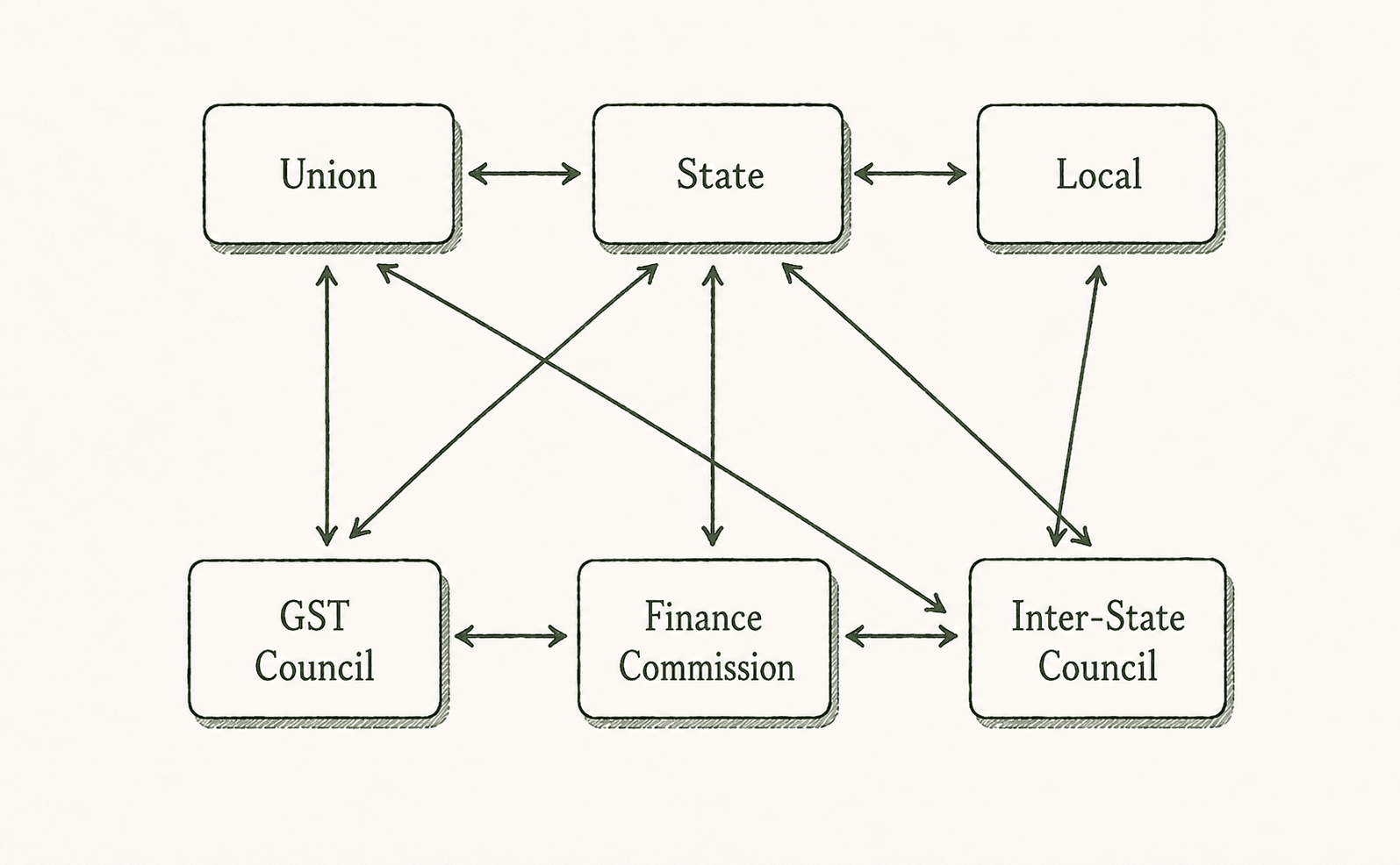
| Visual | What to draw |
|---|---|
| Three-tier block | Union → State → Local, with GST Council / Finance Commission / FC grants as labeled arrows |
| Fiscal flow | Tax pool → devolution formula → State budgets (one line each) |
Legislative and policy flow
For how a bill becomes law or policy implementation, a vertical flowchart beats prose.
Suggested chain (label in exam): Bill introduced → Committee → Houses → President assent → Rules framed → Implementation.
Stakeholders in governance
PYQ fit: Policy contradictions among various competing sectors and stakeholders have resulted in inadequate protection and prevention of pollution in India. (GS II, 2018)
A stakeholder web — industries, regulators, courts, local communities, centre vs state — clarifies who gains and who bears cost.
Paper-specific depth: GS2 answer writing guide.
GS Paper III — economy chains, disaster cycle, environment
GS III is where process diagrams and hazard maps pay off most often.
Economy and agriculture
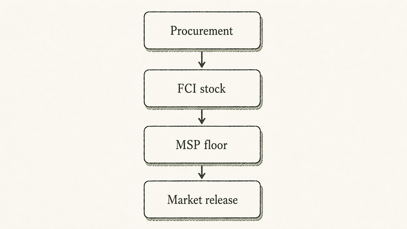
PYQ fit: Elucidate the importance of buffer stocks for stabilizing agricultural prices in India. (GS III, 2024)
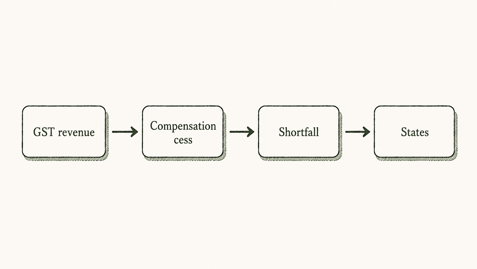
PYQ fit: Explain the rationale behind the Goods and Services Tax (Compensation to States) Act of 2017. (GS III, 2020)
Disaster management
PYQ fit: Vulnerability is an essential element for defining disaster impacts. (GS III, 2019)
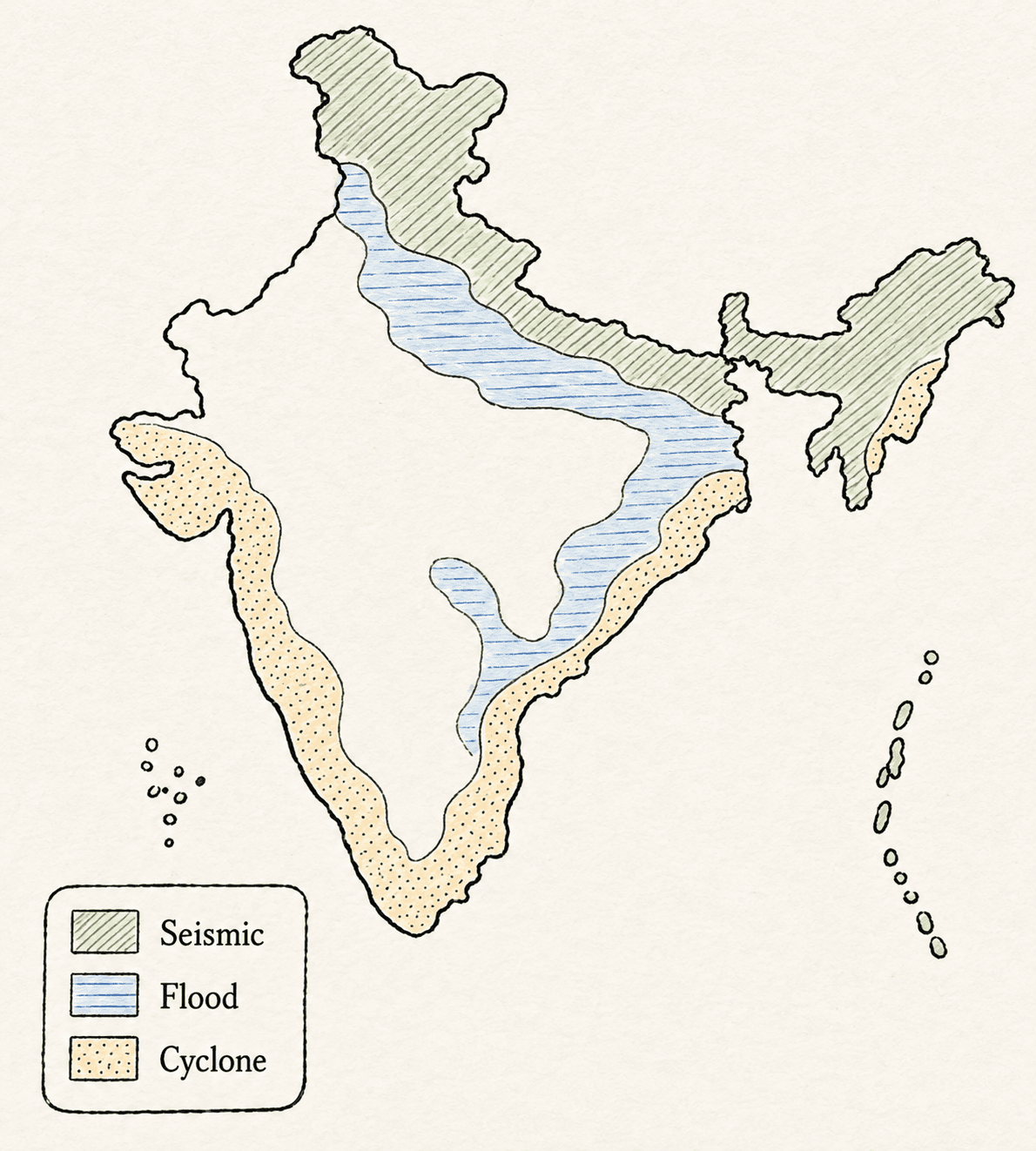
PYQ fit: Disaster preparedness is the first step in any disaster management process. Explain how hazard zonation mapping will help. (GS III, 2019)
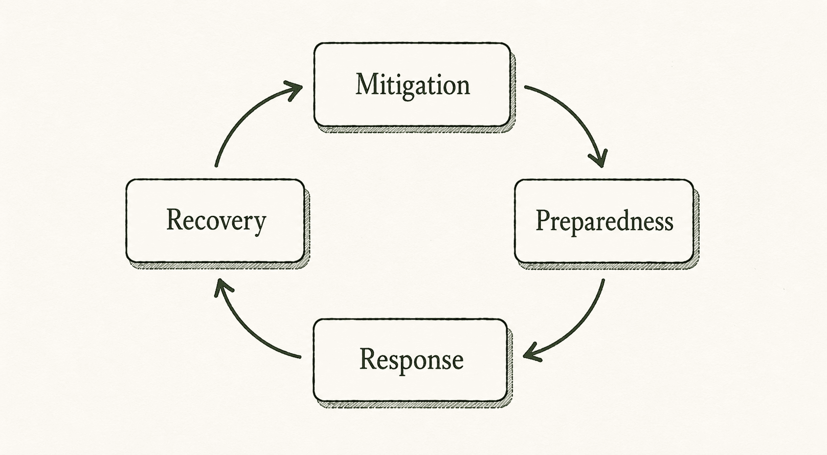
The standard disaster management cycle — mitigation → preparedness → response → recovery — fits many PYQs. For hazard zonation, sketch a map legend: seismic / flood / landslide zones with one policy hook (NDMA, Sendai Framework) in the conclusion.
Paper-specific depth: GS3 answer writing guide.
GS Paper IV — stakeholder maps and ethical decision trees
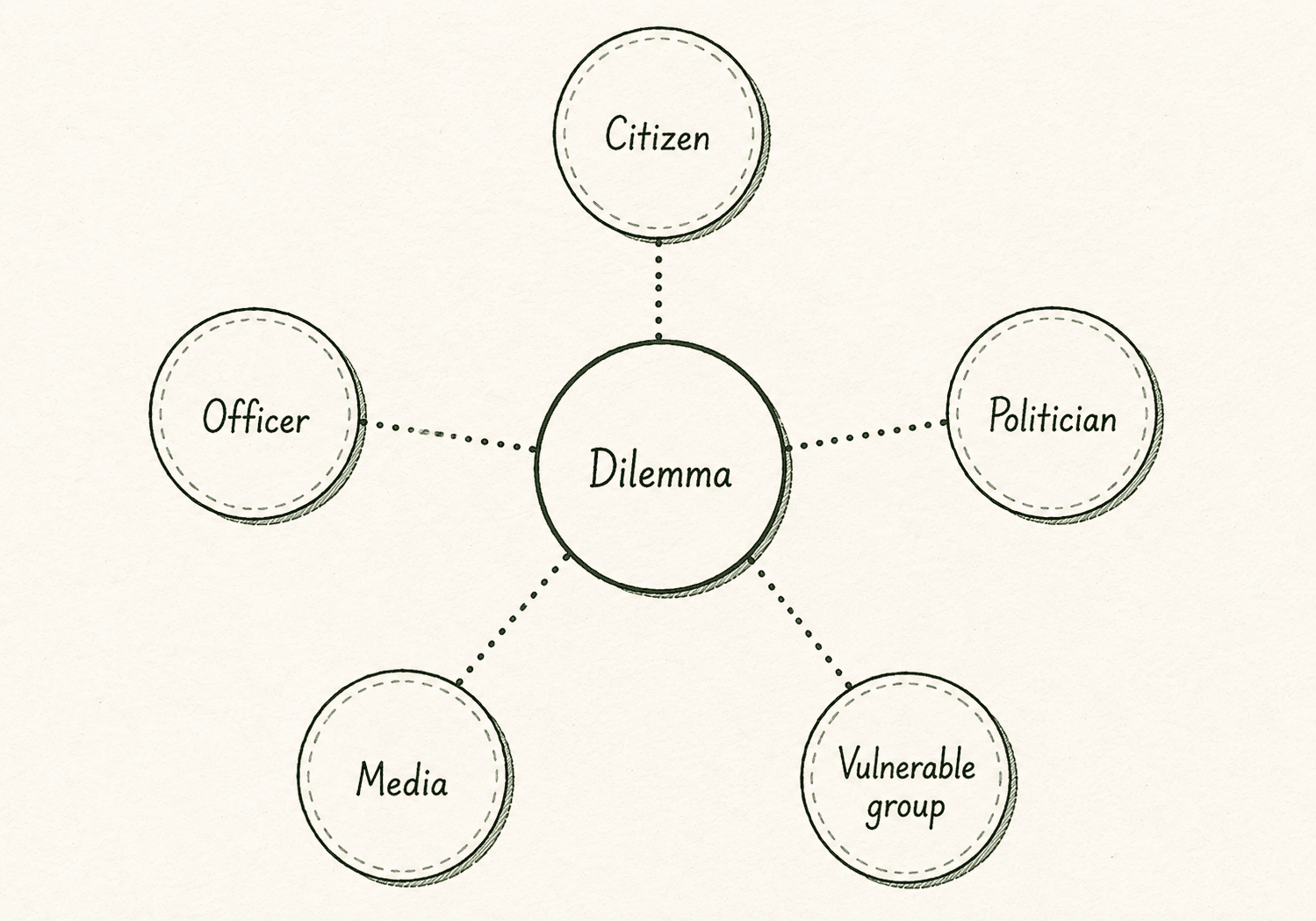
GS IV case studies (20 marks, ~350 words) are the highest-ROI place for a diagram. A stakeholder map in the first five minutes frames the entire answer.
Framework reminder: GS4 case study answer framework · 20-mark case study guide.
| Step | Visual option |
|---|---|
| Facts stated | — |
| Stakeholders | Radial map — citizen, officer, politician, media, vulnerable group |
| Options | Decision tree — Option A / B / C with one-line consequence each |
| Chosen action | Underline recommended branch |
For theory questions (e.g. environmental ethics, probity), use a mind map linking thinkers to principles — sparingly, only when the directive is Discuss or Elucidate.
Paper-specific depth: GS4 ethics answer writing.
Charts and graphs — bar, pie, line
When a question cites census, Economic Survey, or committee percentages, a hand-drawn chart can showcase data without pasting numbers into every sentence.
| Chart | Use when | Example topic |
|---|---|---|
| Pie chart | Parts of a whole (sectoral emissions, budget share) | CO₂ by sector, education spend |
| Bar graph | Compare groups (rural vs urban, male vs female) | Literacy gap, wealth by decile |
| Line graph | Trend over time | Poverty ratio decline, GDP growth |
Rules:
- Title the chart in one line above the figure.
- Label axes or segments — "Rural", "Urban", "2011", "2021".
- Cite the source in text ("per Census 2011") — examiners know approximate values; order of magnitude matters more than pixel-perfect data.
- Do not draw a chart when you do not remember any numbers — a blank graph looks worse than a sentence with one statistic.
Exam-hall drawing rules
- Pencil first, pen second — light pencil outline, then pen labels only if time permits.
- Leave margins — draw in the lower third of a page or beside subheads, not over text.
- Refer in prose — one line: "As shown in the flowchart below, …" so the examiner connects visual and argument.
- Neat beats pretty — rectangles and arrows score; shading and perspective do not.
- Practice at answer-sheet scale — A4 ruled sheets, not tablet screen or A3 coaching posters.
Pair with word limit discipline and time management.
Learn from topper copies — what to copy
Topper copies on UPSCYatra Topper copies show exam-realistic diagrams: small, fast, functional. Study:
| What to notice | What to ignore |
|---|---|
| Diagram size relative to page | Perfect cartography |
| Placement next to subheads | Coaching-style colour fills |
| Label density (2–4 words per node) | Memorised content sentences |
| Frequency (~1 per 2 answers in strong scripts) | Drawing in every question |
Suggested profiles to browse (diagram-heavy papers):
- Gamini Singla (AIR 3) — GS II structure
- Ishita Kishore (AIR 1) — GS I integration
- Jagrati Awasthi (AIR 2) — GS I + ethics visuals
Workflow: attempt the same Mains PYQ under timer → open topper copy → note where they drew, not what they wrote. Full method: how to use topper copies · model answers without memorising.
PYQ practice map — visual type by question
| PYQ (link) | Paper | Suggested visual |
|---|---|---|
| Urbanisation and social problems | GS I, 2013 | Hub / spider diagram |
| Coral bleaching and global warming | GS I, 2019 | Cause–effect + reef map |
| Cyclone formation and SST | GS I, 2024 | Process chain + coast map |
| Cooperative federalism | GS II, 2015 | Institutional diagram |
| Centre–State financial relations | GS II, 2025 | Fiscal flow chart |
| Stakeholder policy contradictions (pollution) | GS II, 2018 | Stakeholder web |
| Buffer stocks and MSP | GS III, 2024 | Procurement flowchart |
| GST compensation to States | GS III, 2020 | Cess → shortfall → transfer |
| Disaster vulnerability | GS III, 2019 | Vulnerability factors map |
| Hazard zonation mapping | GS III, 2019 | Zonation map + cycle |
Weekly practice routine
| Day | Task |
|---|---|
| Mon–Wed | 2 timed PYQs — force one diagram per answer |
| Thu | Redraw 3 diagrams from memory in 5 minutes total |
| Fri | Compare one script with a topper copy — diagram placement only |
| Sat | One full GS paper mock — cap at 12 visuals, track time |
| Sun | Light revision — outline diagrams for 5 PYQs without writing full answers |
Anchor in the complete Mains answer writing guide and self-evaluation checklist.
Common mistakes
| Mistake | Fix |
|---|---|
| Diagram in every answer | Target 10–12 per full GS cycle, not per paper section |
| Unlabelled boxes | Every node gets a noun; every arrow gets a verb if needed |
| Repeating subheads in the sketch | Visual should compress, not duplicate |
| Oversized maps eating half a page | Palm-sized India outline is enough |
| Wrong facts on maps | If unsure, use a table or flowchart instead |
| No textual reference to the visual | One bridging sentence in the body |
More: 10 common answer writing mistakes.
Related guides
- Answer Writing Hub
- Directive words guide
- 10-mark and 15-mark templates
- PYQ answer strategy
- IBC structure
Next step
Pick one PYQ from the table above, write a timed answer with one diagram, then open the matching page on Mains PYQs and a topper copy to compare structure.
Frequently asked questions
How many diagrams should I draw in one GS paper?
Aim for 2–4 per paper — about one visual in every second answer. Across all four GS papers, 10–12 total is a strong target without over-drawing.
Do diagrams really increase marks?
They do not replace content or directive match. They help examiners read your answer faster and signal structured thinking — which supports higher marks when the substance is already there.
Should I draw diagrams in 10-mark questions?
Yes, when the question is spatial or process-based and you can sketch in under 60 seconds. Skip for tight theory-only questions where 150 words need full prose.
Are hand-drawn maps expected to be accurate?
Rough outline and correct relative placement matter more than cartographic detail. Wrong state boundaries or river paths can cost credibility — practise standard India outline weekly.
What is the best visual for GS4 case studies?
A stakeholder map or decision tree after the facts paragraph — see 20-mark ethics guide.
Can I use coloured pens for diagrams?
If your centre allows it, light use is fine. Most toppers use blue/black pen only; clarity beats colour.
Where should I place the diagram in the answer?
Beside or below the most relevant subhead, never floating between unrelated paragraphs. Refer to it once in text.